
Is Power BI dead? Your car already answered that question.

English | Tiếng Việt

Every few months the claim comes back: dashboards are dead. Why would anyone build reports when you can simply ask an AI about your data? Some go further: “Power BI is dead.” It is a good headline and bad advice. The strongest evidence against it comes from the vendors themselves — and from your car.

What the vendors are actually doing

If chat were replacing BI, you would expect Microsoft and Databricks to be winding their BI stacks down. The opposite is happening.

Microsoft is building Copilot into Power BI: “Chat with Your Data” is a chat experience that answers questions about a report or semantic model — it sits on top of the BI stack, not beside it. The old Q&A feature is being retired in favor of this, and Microsoft’s own guidance is blunt about what makes the chat good: a well-prepared semantic model, with clean structure, clear names, and descriptions. Databricks follows the same pattern with Genie: natural-language questions answered over curated, governed data with business context attached.

In other words: the industry is not replacing the dashboard with chat. It is building chat on top of the same foundation the dashboard uses.

The car dashboard test

Think about how you drive.

Your car has a dashboard: speed, fuel, engine temperature, tire pressure. You never ask for these. You glance. The dashboard exists precisely so that the questions you have all the time are answered before you ask them. That is what a dashboard is for: it removes the cognitive load of asking the same standard questions again and again. The KPI is just there.

Now imagine the opposite: a car where you must ask, out loud, “how fast am I going?” every time you want to know. Nobody would buy that car. That is what “replace all reports with chat” actually proposes.

But the dashboard has a limit, and you know it from driving too. “With the fuel I have left, can I still make it to Đà Lạt?” No dashboard has a gauge for that. It is an ad-hoc question: it depends on context, and you ask it rarely. This is exactly where a conversational layer shines — you ask, in your own words, and get an answer computed for your situation.

Two interfaces, one set of sensors:

  • The dashboard answers the standing questions: the twenty KPIs you check every day, identical for everyone, zero effort to consume. Revenue this month, unpaid invoices, stock level, production output.
  • Chat with your data answers the long tail: the one-off, the drill-down, the “why is this number different from last March?” You would never pre-build a report page for each of those; there are too many.

Using chat for your daily KPIs is asking the car for your speed. Cramming two hundred visuals into a report to pre-answer every possible question is printing the whole owner’s manual on the dashboard. Each tool has its job.

The real headline: the semantic model matters more than ever

Here is the part the “dashboards are dead” crowd misses. Both surfaces — the report and the chat — read from the same semantic model: the layer that defines what “revenue” means, how the tables relate, which measure is the official one.

In a car, the speedometer and the range computer read the same sensors. If a sensor is broken, both lie to you. It is the same with data: if the model is messy — duplicated logic, unclear names, no descriptions — the dashboard misleads quietly, and the chat misleads confidently. An AI answering questions over a bad model does not say “your model is unclear”; it gives you a fluent, plausible, wrong answer.

That is why every serious guide to AI-in-BI says the same thing: prepare the model. Clean star schema. One measure per business definition. Descriptions and metadata on tables, columns, and measures, so both a human and an AI know what things mean. Certified, governed models rather than one export per department.

So the stack does not shrink; it re-orders. The semantic model moves from a technical detail to the most valuable data asset a company owns. Build it once, build it well, and it feeds both surfaces — every report today, and every AI feature tomorrow.

What this means in practice

For a small or medium business, the practical order is:

  1. Start with the reports. Get your whole business — finance, sales, operations — onto one clear, trusted set of reports, built on a clean semantic model. This is where the immediate value is, and it forces the foundation to be right.
  2. Add chat as the next level. Once the model is trustworthy, a natural-language layer on top is a modest step, and the answers inherit the model’s quality — including in Vietnamese.
  3. Be suspicious of chat-first offers. If someone promises “just ask your data anything” without talking about the model underneath, ask them what happens when two tables disagree about revenue. The chat interface is the visible 10 percent; the model is the 90 percent that decides whether the answers are true.

The dashboard is not dead. It got a colleague. And they both depend on the same thing: a semantic model that deserves the trust you put in it.

Synnoia builds business reporting and AI question layers on one governed semantic model — reports first, chat as the next level. The first conversation is free.

Microsoft Fabric vs Databricks in 2026: An Honest Place to Start

Đọc bằng tiếng Việt

Two names come up in almost every data conversation we have: Microsoft Fabric and Databricks. This is the first part of a short series where we compare them the way we actually see them on projects, with no vendor spin. We start with the basics: what each one is, where Power BI fits, and why so many teams are stuck on the choice.

The question we keep hearing

“Should we build on Microsoft Fabric or Databricks?” We hear it from finance directors, from IT managers, and from founders who have just been told their Excel files are holding the company back. It is a fair question, and the honest answer is that it depends on your data, your team, and your budget, not on which brand is louder this year.

This series is our attempt to answer it properly. We build on both platforms, so we have no reason to sell you one over the other. In this first part we set the scene. In the next parts we go deep on each platform’s strengths and weaknesses, on how the two are converging, and finally on a simple way to decide.

What Microsoft Fabric is

Microsoft Fabric is a single, unified data platform. It brings data engineering, data storage, modelling, and reporting into one place, on top of shared storage called OneLake. Crucially, Power BI is now a part of Fabric, so the reports your business already knows live in the same platform as the pipelines that feed them.

Fabric is new. Microsoft launched it in November 2023, which makes it about two and a half years old as we write this. That youth cuts both ways, and we will be specific about it in part two. What matters here is the shape: one platform, low-code and professional-code side by side, with the best business-intelligence experience on the market built in.

What Databricks is

Databricks is older and was built from a different starting point. It was founded in 2013 by the creators of Apache Spark, and it grew up serving serious data engineering and machine-learning teams. It is a lakehouse platform: open data formats, large-scale processing, and a deep set of tools for engineers and data scientists who want full control.

If Fabric’s instinct is “make it approachable for everyone”, Databricks’ instinct is “give the engineers real power”. Both instincts are valuable. They just serve different rooms.

Where Power BI fits, and why it is not a third option

This trips people up, so we will be blunt. Power BI is not a third platform competing with Fabric and Databricks. Power BI is the reporting layer, the thing that turns modelled data into dashboards people actually open. It is very popular, and rightly so. But on its own it is not a data platform, and it cannot do the engineering work underneath.

The clean way to see it: there are two platforms, Microsoft Fabric and Databricks, and one shared reporting surface, Power BI, that can sit on top of either. When we say “Microsoft Fabric”, Power BI is already included. When we build on Databricks, we usually still put Power BI on top for the reports.

Why the choice feels hard

The choice feels hard because both platforms are good, and because they are moving toward each other. Databricks is adding stronger reporting and operational features. Fabric is adding stronger engineering features. Both are racing to embed artificial-intelligence agents directly into the platform so that more of the building can be described in plain language. We will spend a whole part of this series on that convergence, because it changes the honest answer.

For now, hold three simple ideas:

  • Fabric is the most approachable and the cheapest to start, and it is unbeatable if your world is already Microsoft and Power BI.
  • Databricks is the most powerful for heavy, complex engineering and machine learning, and it scales without flinching.
  • You do not always have to choose. A hybrid, Databricks underneath and Fabric for the last mile and the reports, is a real and increasingly common shape.

How we will decide, later in this series

By the last part we will give you a short checklist: how much data, how complex the pipelines, how much machine learning, how Microsoft-aligned your team is, and how tight the budget is. Those five questions settle most cases. If you cannot wait for the series, that list is also the fastest way to start a conversation with us.

In part two, we look hard at Microsoft Fabric on its own: what it is genuinely great at today, and where its youth still shows.

This is part one of a five-part series. Synnoia builds on both Microsoft Fabric and Databricks, and delivers reporting through Power BI. The first conversation is free.

How to connect Power BI Dataflows to Excel

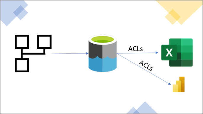
Power BI dataflows (PBI dataflows) is a powerful data prep tool for you to transform data and reuse them in other places downstream. At the same time, while Excel is very popular among business users, there is still, at the time of writing this post, no out-of-the-box connector to import PBI dataflows to Excel. This post aims to solve that pain point.

This post also proposes an alternative to the existing PBI dataflows connector to Power BI Desktop to push the users’ access control to the table level, instead of workspace level like the current connector.

Continue reading “How to connect Power BI Dataflows to Excel”

The Excel Connectors in Power BI

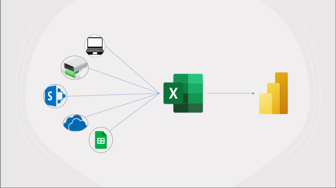
Like it or not, Excel is one of the most popular data sources to build Power BI reports. Surprisingly, except for when you want to connect to an Excel file that is located on your local laptop or a shared network drive, there is no easy way for users to connect to an Excel file that is hosted on cloud services via the Power BI’s user interface (UI).

This blog post will provide you with a universal M script, which you can use to connect to Excel files hosted on not only on-prem sources but also cloud environments, such as OneDrive for Business, SharePoint, and Google Sheets (both public and private). You can download the pbit file in my GitHub repository for a quick start.

Continue reading “The Excel Connectors in Power BI”

Power BI dataflows to store historical data

Power BI dataflows is a nice capability of Power BI. It’s actually not a new Microsoft product. If you use Excel and Power BI long enough, there is a big chance that you’ve already used Power Query at least once. And basically, to keep things simple, it’s just Power Query, but you have to edit it on a web-browser, in Power BI Service.

Pro license is your entrance ticket to use this nice capability. Although Premium licenses (per capacity or per user) provide more advanced features, many applications of Power BI dataflows are already available with Pro license. One of them is to store historical data, and of course, to show them in reports.

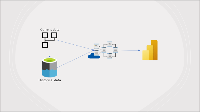
In this blog post, I will briefly introduce Power BI dataflows (with some useful links if you want to learn more). Next, I’ll share how to store historical data in your own storage account and show both current and historical data in a Power BI Report (with ready M scripts, and a pbit file posted on my GitHub repository), so you can roll up your sleeves and start right away with your own use case!

Continue reading “Power BI dataflows to store historical data”

Difference between Power BI Service and Power BI Report Server

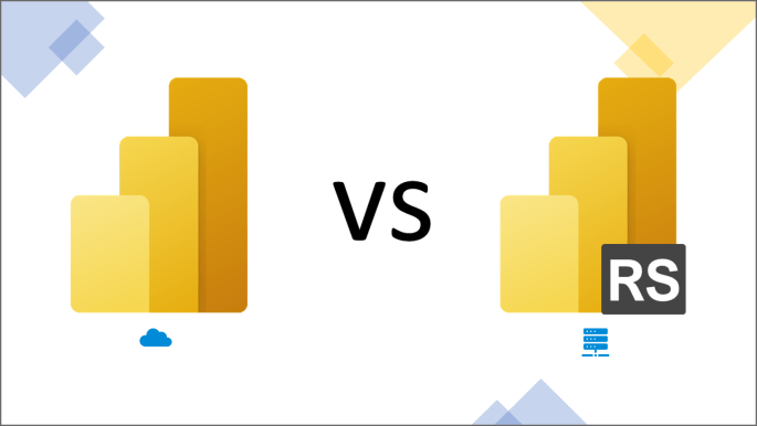
To my surprise, I’ve met many non-tech people and even some from IT who are confused between the two “same same but different” versions of Microsoft Power BI: Power BI Service (cloud version) and Power BI Report Server (on-premise version[1]) .


In this post, I’ll share some tips for non-BI people to identify which version they are using. Then, I’ll provide a holistic comparison of the two versions, hoping to make you more informed of choosing the version that suits your situation best.

Continue reading “Difference between Power BI Service and Power BI Report Server”